
Form Tool
To add a form, select the Form tool from the toolbar or press F, then click anywhere in the page or canvas or just click and drag until you’ll reach the perfect size.

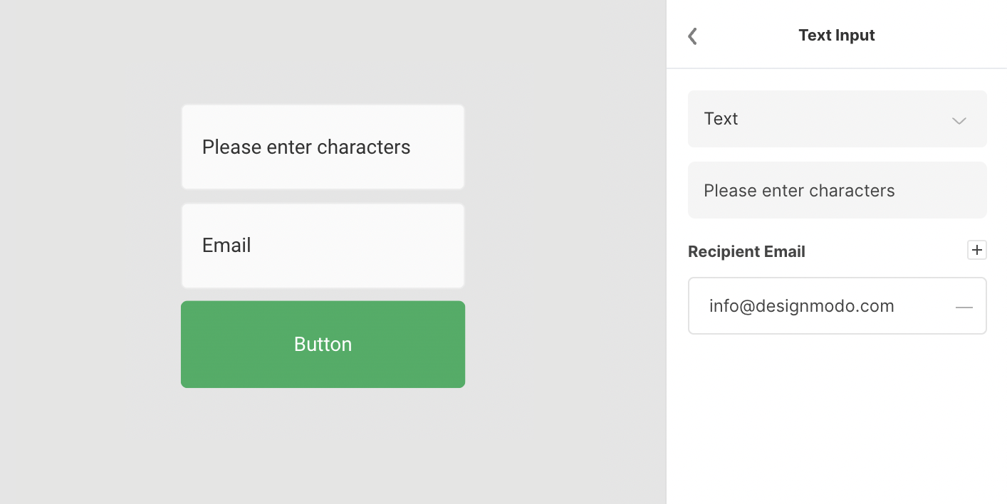
Form options
There are several options and properties in the Inspector panel. This includes options for: positioning, changing the width and height, opacity, adjusting rotation, choosing form type and/or theme, adding or removing form elements, applying states, adjusting fields and button style, modifying text type, enabling or disabling text shadow and/or indicate recipient email.

Refer to the image above to identify form properties panels.
- Width and height
- Opacity
- Rotation
- Form Type
- Form Elements
- States
- Style
- Text
- Text Shadow
- Recipient Email
Learn more about how to use form properties below.
Width and height
Those properties allow changing the size of the form, once hovering on the letter W (width) or H (height) should appear a left-right arrow which allows dragging to the desired size, click and drag, and release after the perfect size is reached.
Alternatively pressing on the number close to W or H letters will allow entering the desired size in px (pixel).
Once the lock icon is pressed it will change to a locked one (default unlocked), this means that when the form will change size it will change proportionally.
 There is another option to change the width and height, by clicking and dragging.
Navigate with the mouse close to the form edge and the arrow cursor should appear.

Click and drag in the desired direction and then release when the perfect size is reached.

The horizontal form type could be adjusted accordingly.

Opacity
Once dragging or typing another value, form transparency will change accordingly, it could be from 0 to 100.

Rotation
Once hovering on the angle icon should appear a left-right arrow that allows dragging to the desired radius, click and drag, and release after the ideal angle was reached.
Right drag - form will rotate in the right (positive value) direction, left drag - it will rotate to the left (negative value).
Alternatively pressing on the number will allow typing the exact degree amount.

Form Type
The form could be aligned:
Vertical (default) – form button will be just below the fields.

Horizontal – form button will be on the right side after all the fields.

There are three predefined form themes, choose the right one that fits perfectly with the project style:
Classic (default) – fields and the button are with rounded corners style.

New Style – fields and the button are with sharp corners style.

Underline – fields style it’s just a line and the button is with sharp corners.

Form Elements
There is a bunch of Form Elements, initially, only 2 of them are applied (name and email) and the button is always enabled.
For adding a new element press on the plus icon.
For removing an element press on the minus icon.

Add as many elements as needed, don’t forget to play around with the width and/or height of the entire form if it's needed, choose between:
- Text – for text information.
- Name – if a user name is required.
- Email – only filled data that contain an email such as name@mail.com or similar.
- Phone number – only for number characters and + (plus) sign.
- Dropdown – for choosing an option from multiple selections.

Placeholder field name could be customized to any other desired name for this press on the setting icon on the right side after the field name.

After the site user will press the form button, all the filled data will be sent to the recipient's email, recipient should receive an email that looks like this.

States
Style, border, text and text shadow are the properties referring to States.
States could be Default and Hover
Default is that style that the user sees instantly but the hover it’s generally triggered when the user hovers over form elements with the cursor (mouse pointer).
It’s not mandatory to use Hover State, it could be removed by pressing the minus icon.

Style
Style refers to how fields and the form button look like.
Fields could have any color, opacity, any space between form elements and/or rounded corners.
The border could be applied or removed.

Press on the square icon to choose any desired color of the form fields.

Play around with space between and/or rounded corners, as well feel free to experiment with the border.

Switch to the Button tab and play around with button color, rounded corners and border (optional).

Text
Text property will allow choosing the text family, text weight, text size, text color, text opacity, letter spacing (could be negative value as well) and align position for the text in the field and/or button.

Scroll back to Style and switch tab to Button to play around with button text style.

Text Shadow
This property is usually used for giving the impression that the text is raised above.
Just press on the plus icon to add it.

By default, it will be assigned a black color (#000000) with 25% of opacity, with the X (right) and Y (down) axis to 1px, and with the blurriness to 3px.
Text Shadow property could be adjusted to your needs, just click on the icon close to the first number in the row and the additional panel will appear immediately.

Recipient Email
The default recipient email will be that one you had signed in with, additional emails could be added if needed, press the plus button for this.
Or press on the minus icon to remove any additional recipient email.
